Golden Ratio
In photography, two rules are to take into consideration– The Golden Ratio and The Rule of Thirds and, it is still being discussed about which rule is “better to use”.
The composition may be symmetrical and asymmetrical. To make the picture more pleasant, and harmonious, and to avoid the central composition, old masters were applying various methods and mathematical calculations. Since symmetrical compositions are sometimes monotonous and static, the golden ratio is used as one of the solutions. This rule is defined by the Roman architect Vitruvius, who tried to establish unequal distribution and asymmetry of space that is pleasant and attractive to human visual experience. This is a classic mathematical formula for a balanced distribution of “weight” in the picture. I drew here a geometric representation of the construction of the composition that follows the rule of the golden ratio; but the point is not to over-calculate, to restrict the artist’s freedom with mathematical calculations. The idea is to train the eye to pre-identify naturally these relationships. Ultimately, one photographs with the eye, but not the camera.
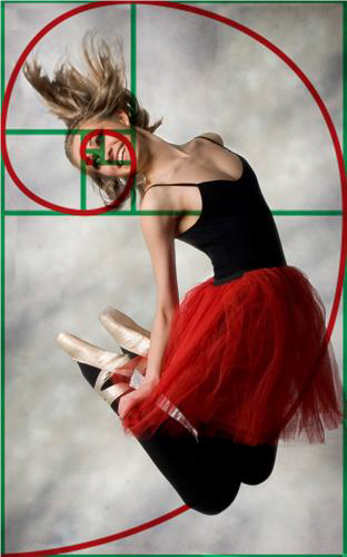
The Golden Rectangle is considered to be one of the most visually satisfying of all geometric forms. We can find many examples in art masterpieces. The golden rectangle has the property that when the inner square is removed, a smaller rectangle of the same proportions remains. Thus a smaller inner square can be removed, and so on to the hypothetical infinity, with a spiral pattern resulting.

The Golden Ratio is a specific relationship between two sizes that meet the following rule: the ratio of their sum to larger size is equal to the ratio of the larger size to the smaller.
(a+b)/a = a/b
a+b is to a as a is to b

Expressed mathematically, 1.618 represents this ideal proportion and formats corresponding to the rule of the golden ratio are standards of photography, for example: 13 x 21 cm, 18 x 30 cm, 24 x 39 cm. Using this ratio, Fibonacci, an Italian mathematician, noticed a series in many physical, chemical and biological phenomena. Fibonacci sequence represents one in which the sum of the last two numbers in the sequence gives a value of the next member from the sequence – 0, 1, 1, 2, 3, 5, 8, 13, 21, 34, 55, 89, 144.
The golden triangle is generated from the same ratio. It’s more convenient for photos with diagonal lines. There are three triangles with corresponding shapes.

Rule of thirds
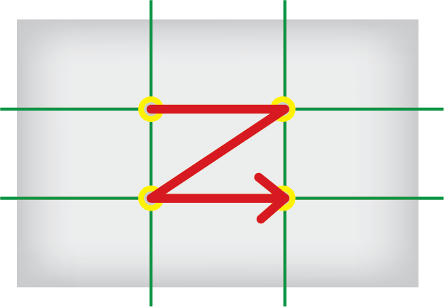
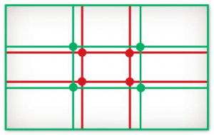
Another rule used to avoid the central composition, although it is basically symmetrical, is this rule. In the following drawing, the rule of thirds is marked with the green line, and red lines show the proportions of the golden ratio. Landscapes are the best example of the application of this rule. Rule of third says: the best solution for the horizon, or objects in an image, is to be placed on one of the lines that cut format into thirds, or at the intersection of one of those horizontal and vertical lines. Indeed, by placing the object in the center of the image, the result may be a flat, lifeless picture, Therefore, to avoid this monotonous symmetry, the subject should be placed on one of the thirds of the format.

Rule of thirds is very useful for instance, in square formats, in which the balance is simply hard to get. This is useful to know, especially with the rise of social networks and mobile applications that apply the square format images. Instagram is the most popular application that uses square format photography, and it gained an artistic dimension with numerous photo contests nourishing a special kind of aesthetics.


Many photographers still argue over the golden section/rule of thirds, but one reason goes in favor of the golden section. The rule of thirds is too obvious, too geometrical and noticeable at first glance, and even symmetrical in its essence, and the golden section works more unexpectedly, looks natural, and therefore, images gain on asymmetry and spontaneity. The rule of thirds is applied to the photo above on the left. You may notice that the landscape ends and the sky begins at the first third of height. In the photo to the right the horizon is slightly lifted, but doesn’t reach half of the height. It is “spontaneity” I mentioned, the image doesn’t seem so “calculated”. The golden ratio here is applied so that the horizon ends at a height of the intersection of the first two inner squares of the format.


Reading of the image
Scientific tests have shown that all people of the same culture have the same visual pathway. To clarify, when we look at the picture, we are guided by our cultural habits, for example, Europeans tend to scan the image from the left to right and from the top to bottom. So when looking at a picture, we do it in the same way we read a text, the brain scans the image in this way and everything is done unconsciously. This horizontal scanning is why a photograph with a dominant horizontal is restful to the eye (evokes calm, and depth, and can enlarge the image), while the dominant vertical will be tiring (and can evoke rigidity).

Given that the clear and sharp field of view is very small, our eyes will scan the image surface extremely fast with continuous movement to perceive the image in its entirety. In this process, several factors are involved. As seen in the drawing, points of intersection will have priority.
The eye focuses also on more detailed parts of the picture, the bigger and closer objects, and the center of the image. Some other factors directing the focus are sharpness, consistency, foreground, and warm colors. A final element that attracts the eye, is the human appearance. If you put a person in a scene, the look of the eye is going to focus primarily on this character. More precisely, it is the face that attracts the most. Similarly, in a face, the eye look is the most important. This is why, for example, for famous lingerie advertisements, the photographer avoids putting the model’s face in the scene, because the product should be highlighted and the presence of a face would distract the focus.